
To build a personal dashboard that integrates data from different apps, start by choosing tools with strong API support, like Zapier or Google Data Studio. Connect your apps—such as calendar, fitness, or finance platforms—and automate data transfers for real-time updates. Use visualizations like charts and graphs to make insights clear and actionable. Keep the dashboard simple and focused on what matters most. Continue exploring to discover how to optimize your data integration and visualization strategies.
Key Takeaways
- Choose a dashboard platform that supports robust API integration and data visualization tools.
- Use automation services like Zapier or IFTTT to connect and sync data from multiple apps seamlessly.
- Integrate sources such as calendar, email, fitness, and finance apps to gather comprehensive data.
- Visualize data with charts and graphs to identify patterns, trends, and actionable insights easily.
- Keep the dashboard simple and focused on key metrics to enhance usability and motivation.
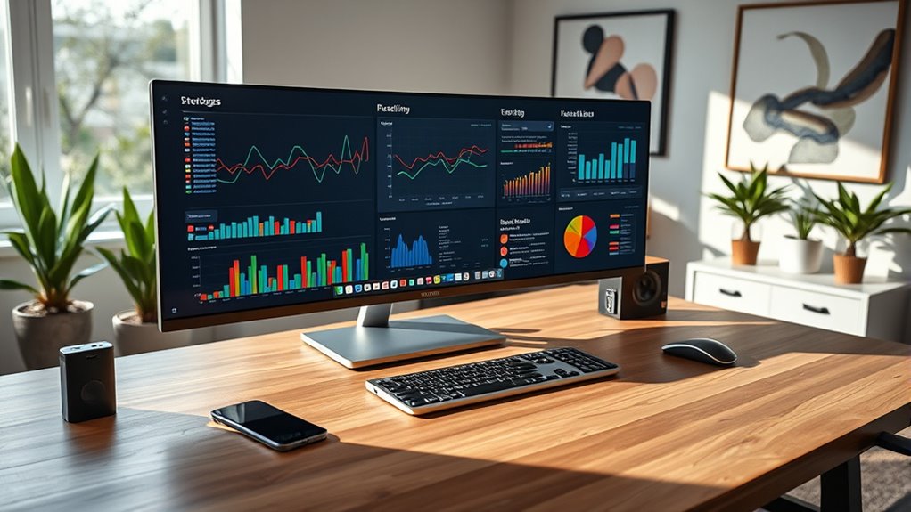
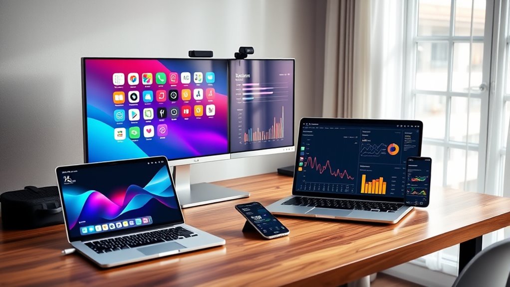
Creating a personal dashboard can considerably streamline how you manage your daily tasks and track your goals. It’s a centralized hub where you bring together data from various apps and sources, giving you a clear picture of your productivity, habits, and progress. One of the key elements that makes this possible is API integration. APIs, or Application Programming Interfaces, act as bridges that allow your dashboard to connect seamlessly with different apps like your calendar, email, fitness tracker, or finance tools. By integrating these APIs, you enable your dashboard to automatically pull in real-time data without manual updates, saving you time and reducing the chance of errors. This automated data flow ensures your dashboard remains always current, giving you instant access to relevant information whenever you need it. Additionally, understanding how to interpret data visualization is crucial for turning complex information into actionable insights. Once your data is flowing in through API integrations, the next step is to make sense of it through data visualization. Data visualization transforms raw numbers into visual formats like charts, graphs, and dashboards that are easy to interpret. Instead of sifting through spreadsheets or multiple apps, you get a visual summary of your progress and patterns. For example, a line chart can show your productivity trends over the week, while pie charts can break down your time spent on different tasks. Data visualization empowers you to quickly identify areas where you’re excelling and those needing improvement. It also helps in setting realistic goals by providing visual cues that motivate you to stay on track. To build an effective personal dashboard, you’ll want to select the right tools that support API integration and robust data visualization options. Platforms like Zapier or IFTTT can help automate data flow between apps, while tools like Tableau, Power BI, or even Google Data Studio can turn your integrated data into compelling visual reports. Setting up these integrations might require some initial effort, but once configured, they work quietly in the background, presenting you with a thorough view of your life and work. The key is to keep your dashboard simple and relevant—focus on the data that truly impacts your goals, and use visualization to highlight insights clearly.
personal dashboard software
As an affiliate, we earn on qualifying purchases.
As an affiliate, we earn on qualifying purchases.
Frequently Asked Questions
How Do I Choose the Best Apps for My Dashboard?
You should choose apps that excel in data visualization and seamlessly support app integration. Look for ones that connect easily with your existing tools, offering reliable data syncing. Prioritize user-friendly interfaces and customizable features to tailor your dashboard. Check reviews and test compatibility beforehand. This way, you guarantee your dashboard provides clear insights, stays updated, and integrates smoothly, helping you make better decisions quickly.
What Security Measures Are Needed for Integrated Data?
You need solid security measures like data encryption and user authentication to safeguard your integrated data. While encryption keeps your data safe from hackers, user authentication ensures only you access sensitive information. Balancing accessibility with security, you should also implement multi-factor authentication and regularly update your security protocols. Think of it as locking your home; strong locks and alarms keep your data secure while you enjoy seamless access.
Can I Customize My Dashboard for Different Devices?
Yes, you can customize your dashboard for different devices by ensuring cross-platform compatibility and utilizing responsive design. This way, your dashboard adapts seamlessly to desktops, tablets, and smartphones. You can tailor layouts, resize elements, and prioritize data views based on device size. With responsive design, your dashboard remains functional and visually appealing, giving you a consistent experience whether you’re on a phone or a computer.
How Often Should I Update or Refresh Data Sources?
Think of your data as a garden that needs regular watering. You should refresh your data sources based on your data update schedule, typically daily for real-time insights or weekly for broader trends. Adjust the refresh frequency to match how often your data changes. By doing so, you keep your dashboard lively and accurate, ensuring you’re always working with fresh, reliable information.
Are There Free Tools for Building a Personal Dashboard?
Yes, you can find free tools for building a personal dashboard that prioritize data privacy and support API integrations. Tools like Google Data Studio, Microsoft Power BI Desktop, and Airtable offer free plans, enabling you to connect various apps securely. Just make certain you review their data privacy policies and set up API integrations carefully to protect your data while creating a customized dashboard tailored to your needs.
API integration tools for data visualization
As an affiliate, we earn on qualifying purchases.
As an affiliate, we earn on qualifying purchases.
Conclusion
Now that you’ve built your personal dashboard, you’re like a modern-day Da Vinci, masterfully blending data from various apps into one seamless view. With a few clicks and some clever integrations, you can stay organized and informed, much like a Renaissance inventor managing multiple projects. Remember, in this digital age, your dashboard is your compass—guiding you through the chaos of daily life with clarity and purpose. Embrace it, and watch your productivity soar.
data visualization tools for dashboards
As an affiliate, we earn on qualifying purchases.
As an affiliate, we earn on qualifying purchases.
automation tools for app integration
As an affiliate, we earn on qualifying purchases.
As an affiliate, we earn on qualifying purchases.